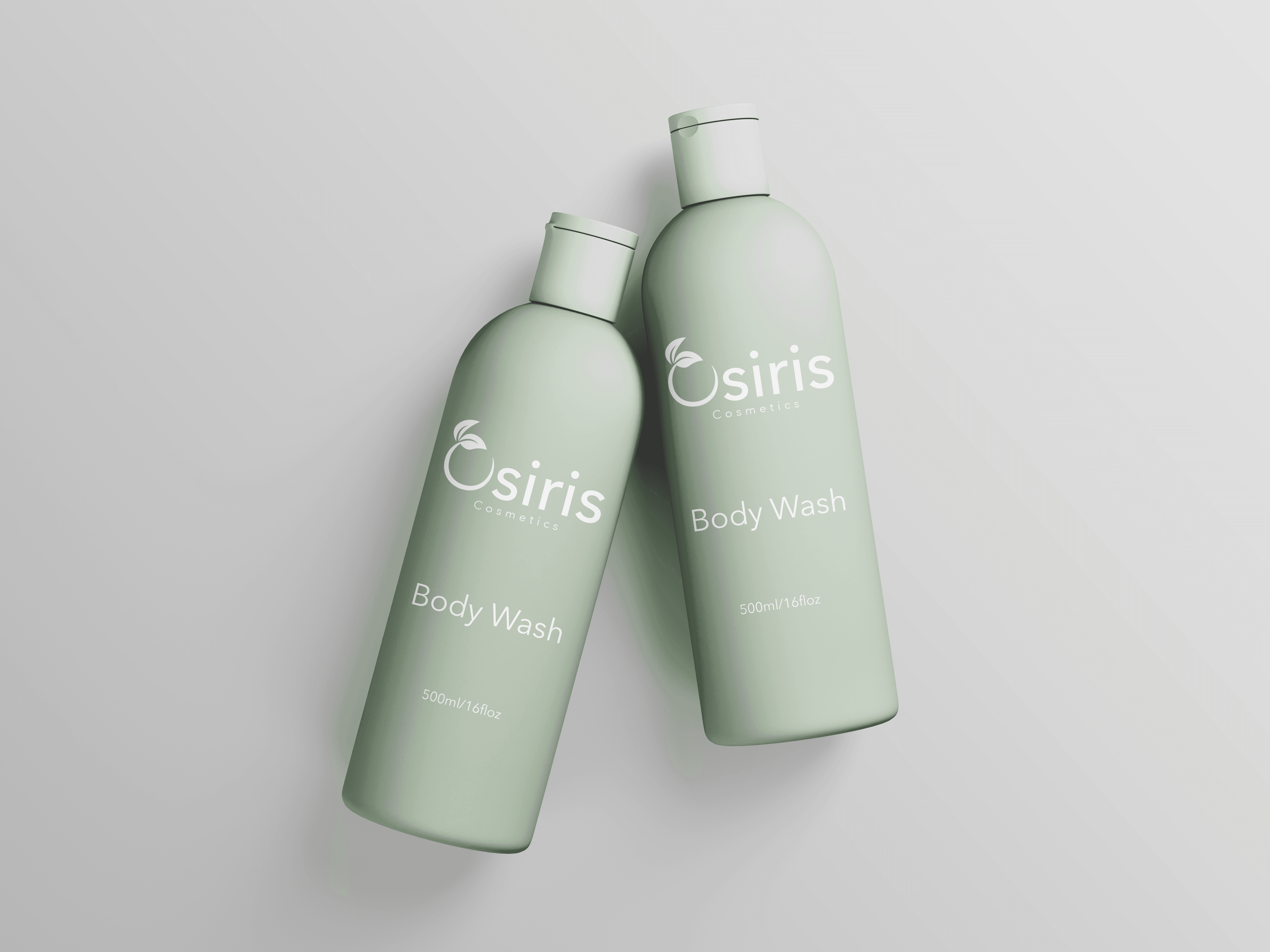
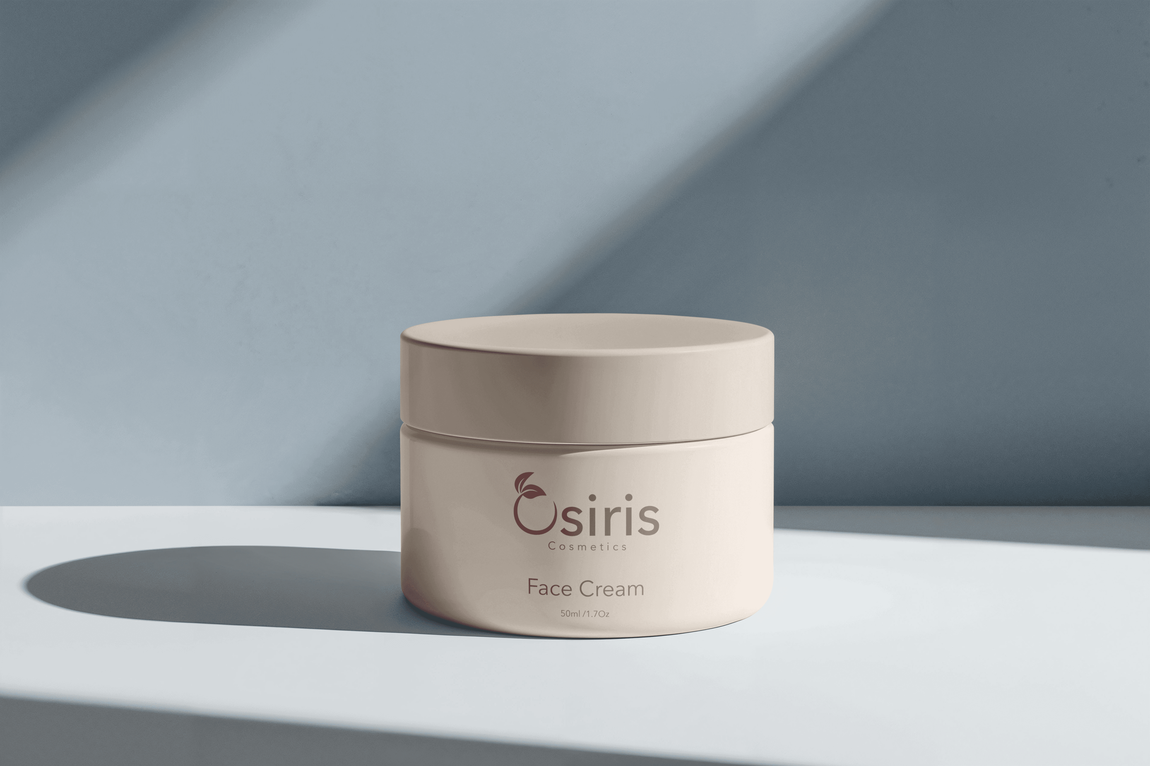
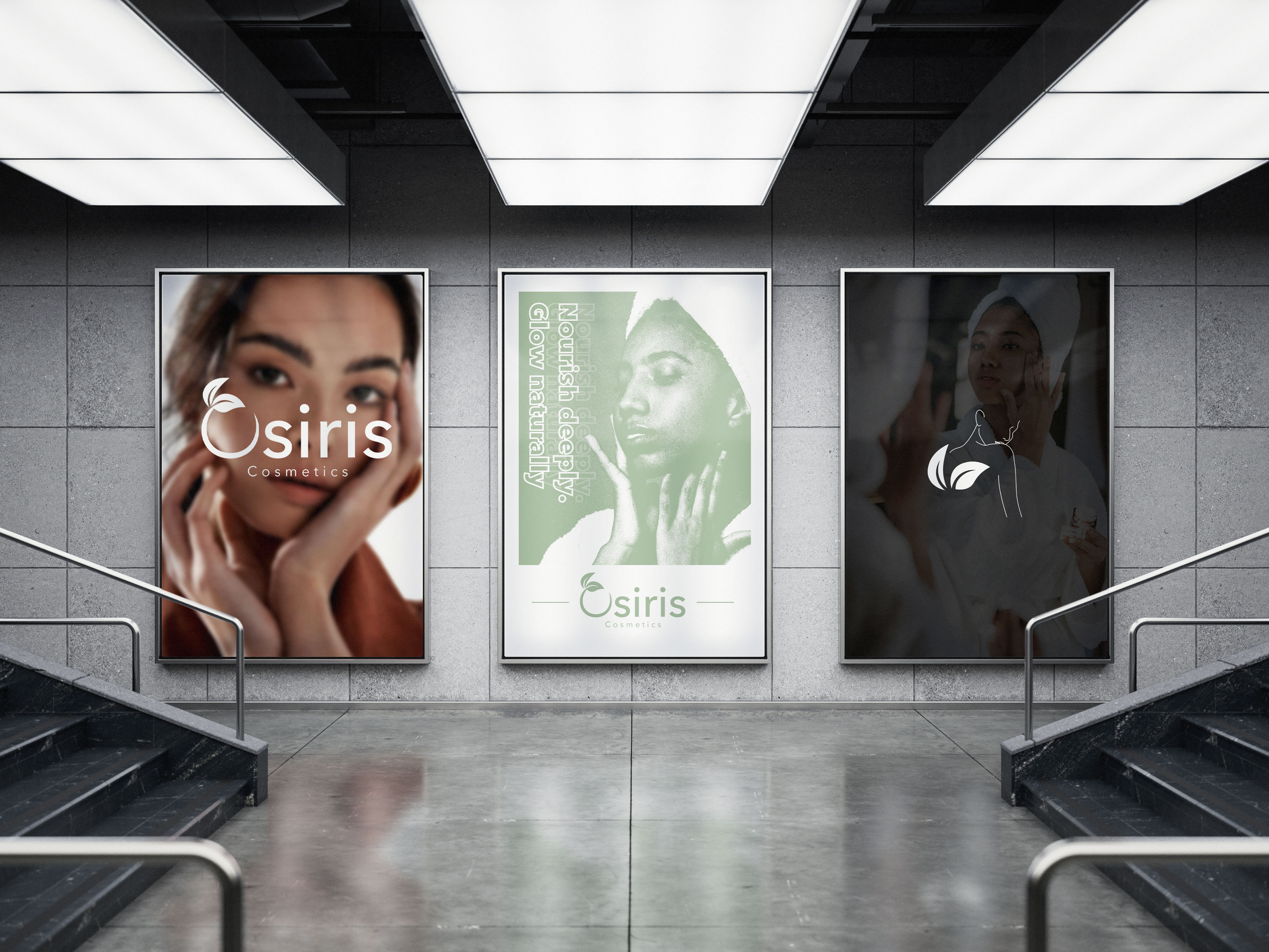
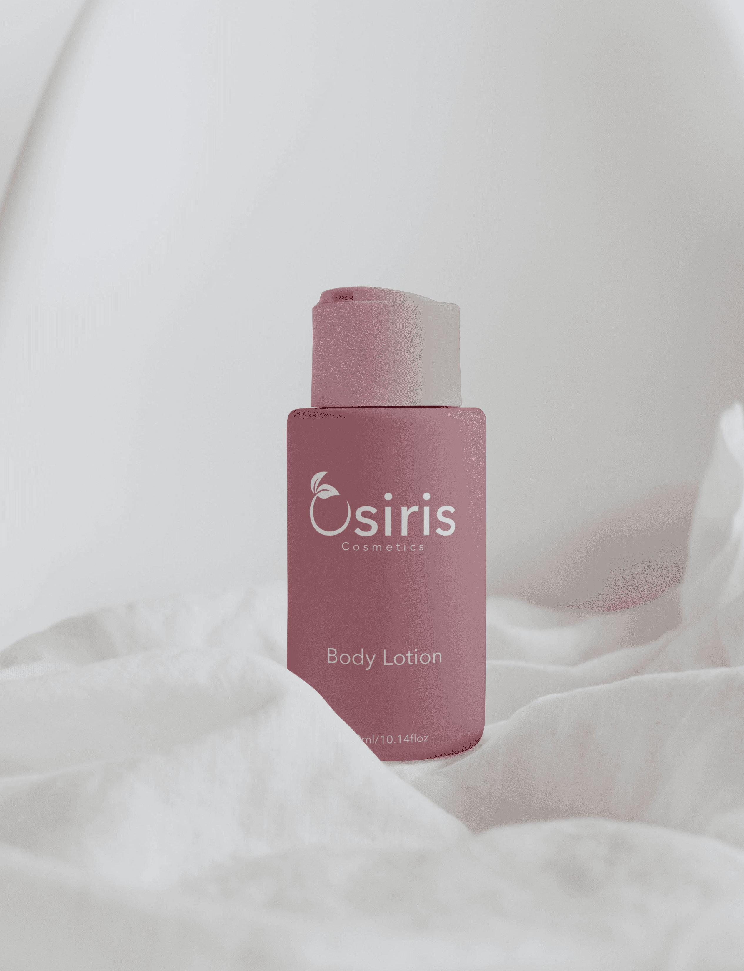
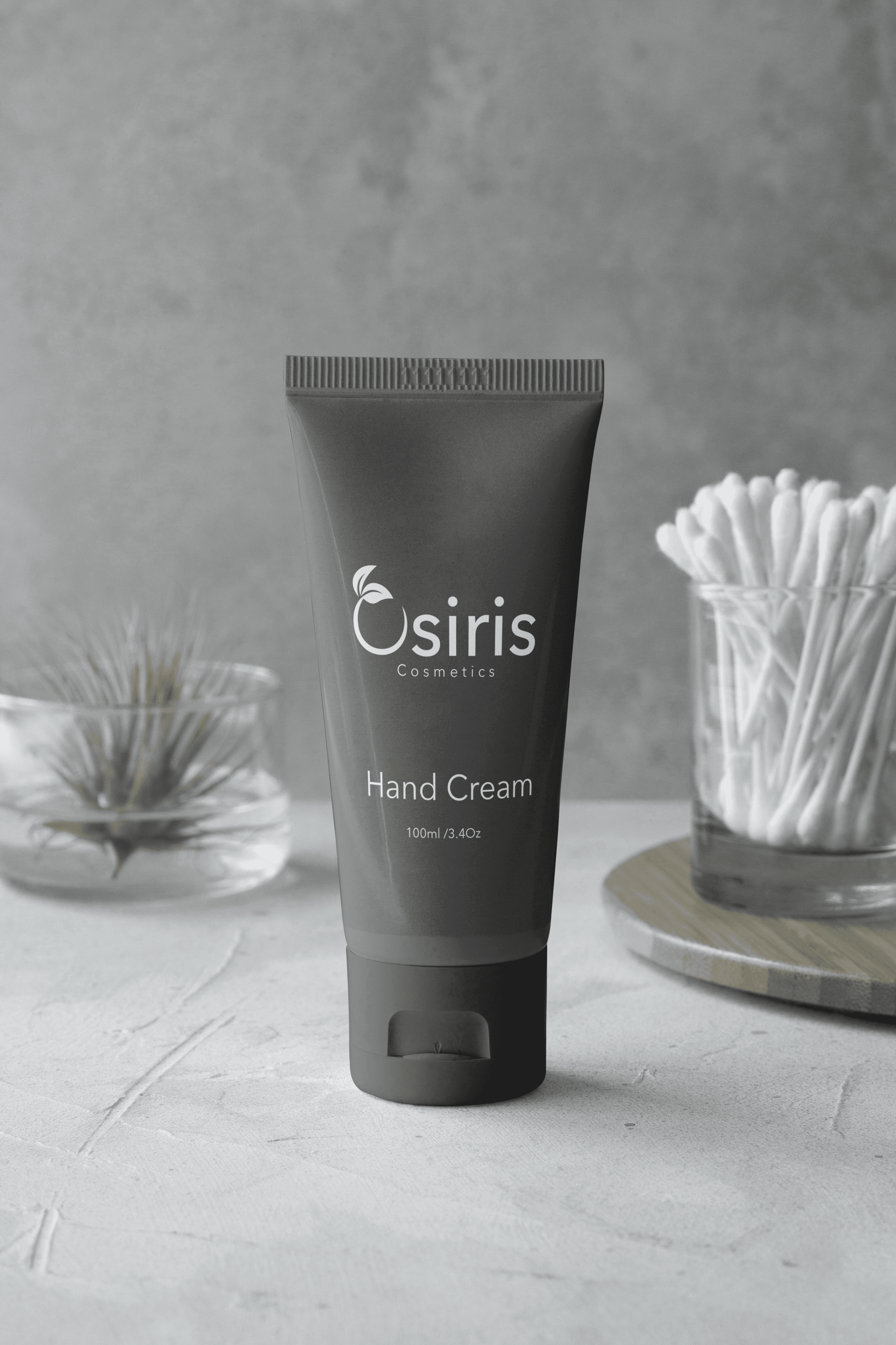
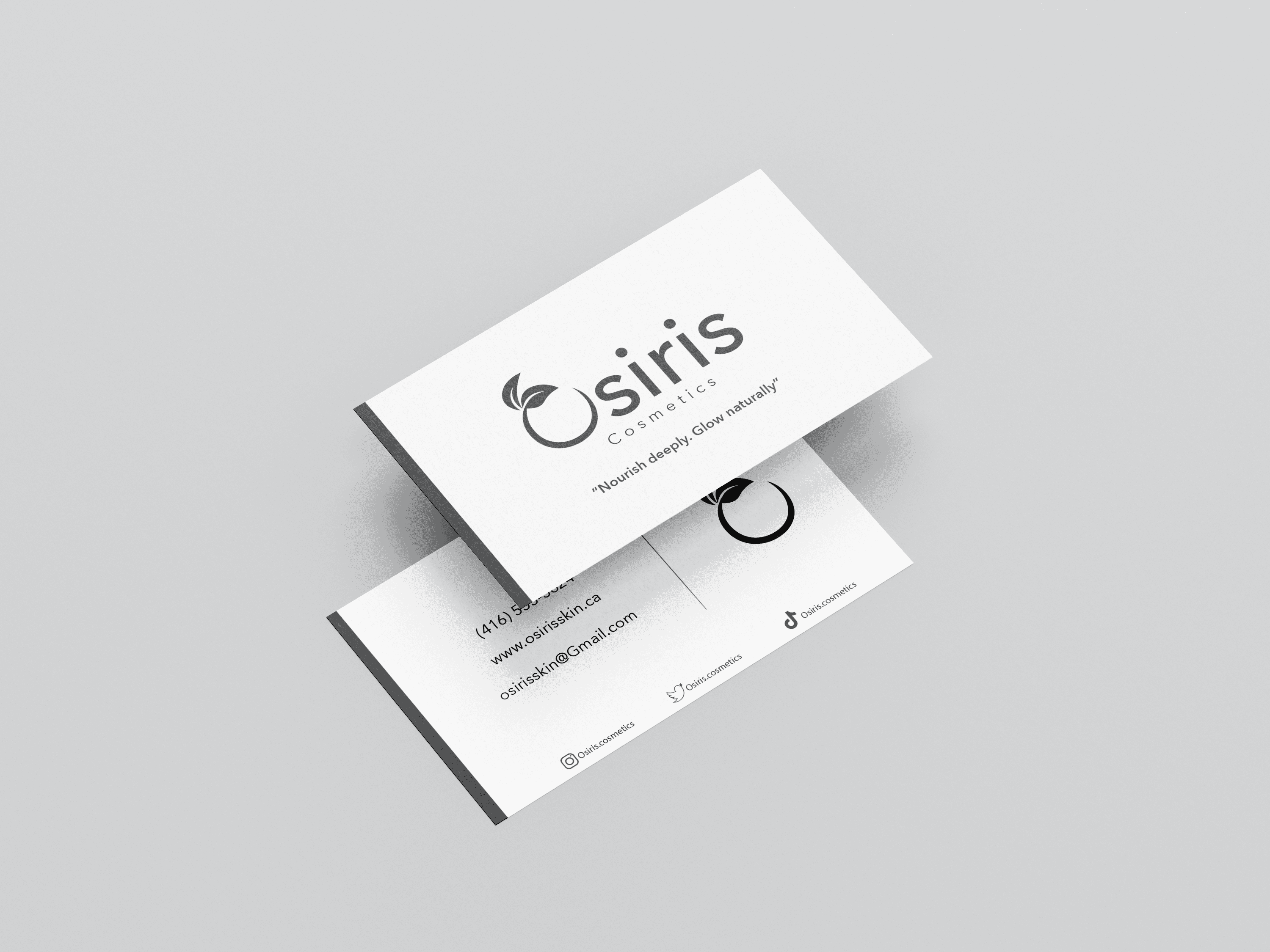
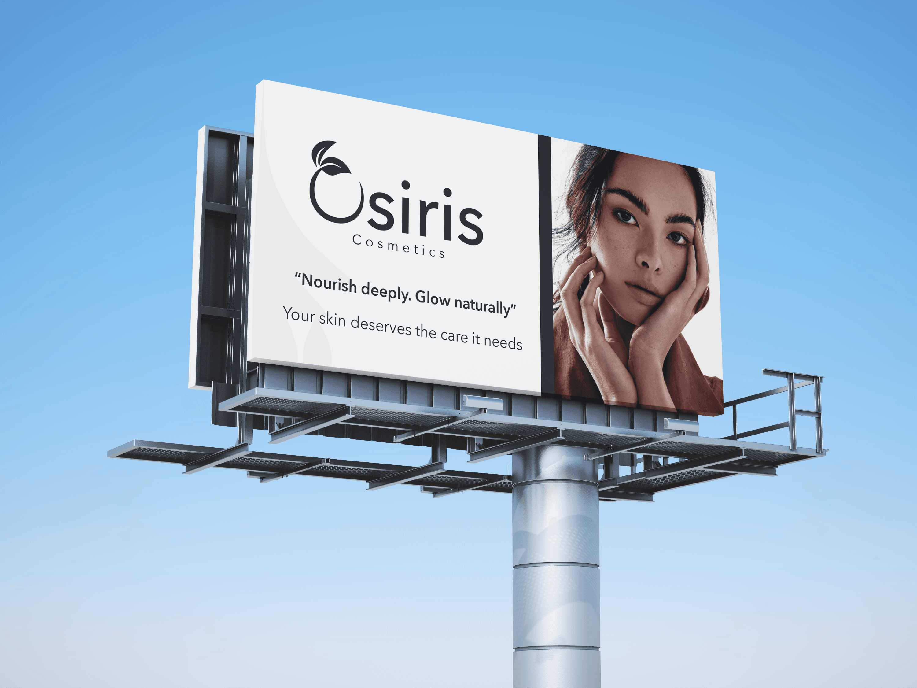
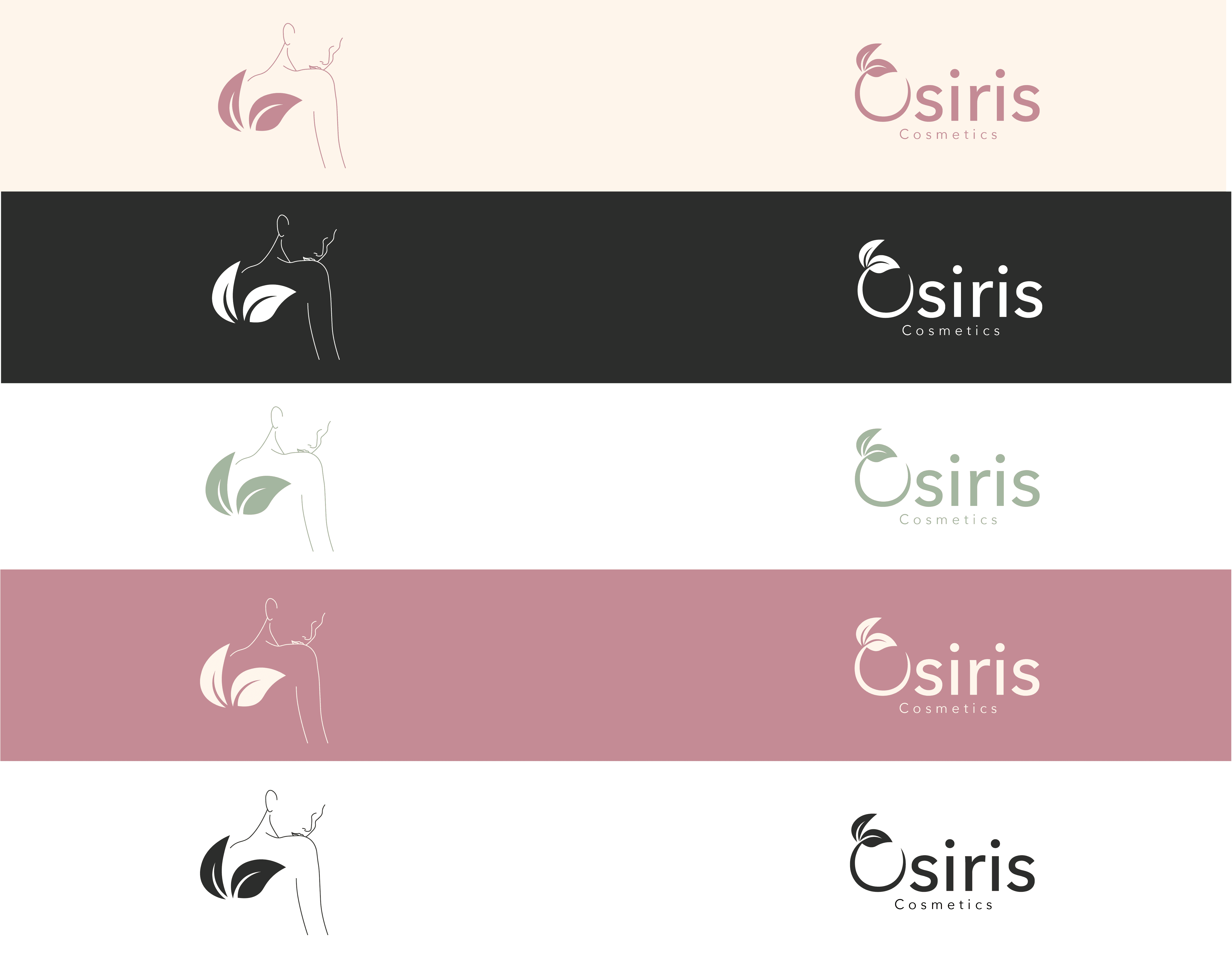
For the icons and logo I wanted to portray the natural feeling of this brand while also keeping the simplicity of the brand, while with the assets and colour i wanted to push myself and appeal to the woman who would want to purchase an item like this so creating illustrative assets and choosing the colour palette was something I focused hard on.
Icons, Logo & Art Assets
Challenge & Solution
The main challenges I faced while creating this project were appealing to my target audience women and selecting the right colour palette. Targeting women was difficult because it was a demographic I hadn’t designed for before, and I needed to understand how my design choices could influence their interest in the product. Colour selection was also a struggle, as I hadn’t previously worked with bright or vibrant colours, nor colours typically associated with women, which made it harder to decide what best represented the brand.
To overcome these challenges, I used online tools like colour pickers to test how different colours worked together, and I asked my mom, sister, and other female friends for feedback. They helped me understand how the colours felt and suggested improvements, such as using softer tones of the main product colours instead of different colours for the caps. This advice helped elevate the overall design. I’m very proud of how the project turned out, and it boosted my confidence in designing for different age groups and genders going forward.
*Mekhi Blair
Designers
I'm very proud of this project and happy with the way it turned out. This project also helped boost my confidence in branching out to target different age and gender groups.
Takeaway
*Branding
*Cosmetic/Skin Care
Programs Used
Year
2025
*Photoshop
*Illustrator
Category
Osiris Cosmetics
Osiris Cosmetics is a holistic skincare and wellness brand rooted in the earth and crafted for the modern, mindful woman. Inspired by ancient rituals and grounded in nature, Osiris blends botanical ingredients, gentle formulations, and intentional design to create products that nourish the skin and calm the senses.
Osiris strives to create natural skincare that’s not only authentic, but also refreshing made to restore, hydrate, and bring balance to your everyday ritual. Our aesthetic is warm, feminine, and minimal, celebrating timeless beauty and slow, intentional care. More than cosmetics, Osiris is a return to stillness, softness, and self.
*Branding
*Cosmetic/Skin Care
Programs Used
Year
2025
*Photoshop
*Illustrator
Category
Osiris Cosmetics
Osiris Cosmetics is a holistic skincare and wellness brand rooted in the earth and crafted for the modern, mindful woman. Inspired by ancient rituals and grounded in nature, Osiris blends botanical ingredients, gentle formulations, and intentional design to create products that nourish the skin and calm the senses.
Osiris strives to create natural skincare that’s not only authentic, but also refreshing made to restore, hydrate, and bring balance to your everyday ritual. Our aesthetic is warm, feminine, and minimal, celebrating timeless beauty and slow, intentional care. More than cosmetics, Osiris is a return to stillness, softness, and self.
For the icons and logo I wanted to portray the natural feeling of this brand while also keeping the simplicity of the brand, while with the assets and colour i wanted to push myself and appeal to the woman who would want to purchase an item like this so creating illustrative assets and choosing the colour palette was something I focused hard on.
Icons, Logo & Art Assets
Challenge & Solution
The main challenges I faced while creating this project were appealing to my target audience women and selecting the right colour palette. Targeting women was difficult because it was a demographic I hadn’t designed for before, and I needed to understand how my design choices could influence their interest in the product. Colour selection was also a struggle, as I hadn’t previously worked with bright or vibrant colours, nor colours typically associated with women, which made it harder to decide what best represented the brand.
To overcome these challenges, I used online tools like colour pickers to test how different colours worked together, and I asked my mom, sister, and other female friends for feedback. They helped me understand how the colours felt and suggested improvements, such as using softer tones of the main product colours instead of different colours for the caps. This advice helped elevate the overall design. I’m very proud of how the project turned out, and it boosted my confidence in designing for different age groups and genders going forward.
*Mekhi Blair
Designers
I'm very proud of this project and happy with the way it turned out. This project also helped boost my confidence in branching out to target different age and gender groups.
Takeaway
*Branding
*Cosmetic/Skin Care
Programs Used
Year
2025
*Photoshop
*Illustrator
Category
Osiris Cosmetics
Osiris Cosmetics is a holistic skincare and wellness brand rooted in the earth and crafted for the modern, mindful woman. Inspired by ancient rituals and grounded in nature, Osiris blends botanical ingredients, gentle formulations, and intentional design to create products that nourish the skin and calm the senses.
Osiris strives to create natural skincare that’s not only authentic, but also refreshing made to restore, hydrate, and bring balance to your everyday ritual. Our aesthetic is warm, feminine, and minimal, celebrating timeless beauty and slow, intentional care. More than cosmetics, Osiris is a return to stillness, softness, and self.
*Branding
*Cosmetic/Skin Care
Programs Used
Year
2025
*Photoshop
*Illustrator
Category
Osiris Cosmetics
Osiris Cosmetics is a holistic skincare and wellness brand rooted in the earth and crafted for the modern, mindful woman. Inspired by ancient rituals and grounded in nature, Osiris blends botanical ingredients, gentle formulations, and intentional design to create products that nourish the skin and calm the senses.
Osiris strives to create natural skincare that’s not only authentic, but also refreshing made to restore, hydrate, and bring balance to your everyday ritual. Our aesthetic is warm, feminine, and minimal, celebrating timeless beauty and slow, intentional care. More than cosmetics, Osiris is a return to stillness, softness, and self.
For the icons and logo I wanted to portray the natural feeling of this brand while also keeping the simplicity of the brand, while with the assets and colour i wanted to push myself and appeal to the woman who would want to purchase an item like this so creating illustrative assets and choosing the colour palette was something I focused hard on.
Icons, Logo & Art Assets
Challenge & Solution
The main challenges I faced while creating this project were appealing to my target audience women and selecting the right colour palette. Targeting women was difficult because it was a demographic I hadn’t designed for before, and I needed to understand how my design choices could influence their interest in the product. Colour selection was also a struggle, as I hadn’t previously worked with bright or vibrant colours, nor colours typically associated with women, which made it harder to decide what best represented the brand.
To overcome these challenges, I used online tools like colour pickers to test how different colours worked together, and I asked my mom, sister, and other female friends for feedback. They helped me understand how the colours felt and suggested improvements, such as using softer tones of the main product colours instead of different colours for the caps. This advice helped elevate the overall design. I’m very proud of how the project turned out, and it boosted my confidence in designing for different age groups and genders going forward.
*Mekhi Blair
Designers
I'm very proud of this project and happy with the way it turned out. This project also helped boost my confidence in branching out to target different age and gender groups.
Takeaway
For the icons and logo I wanted to portray the natural feeling of this brand while also keeping the simplicity of the brand, while with the assets and colour i wanted to push myself and appeal to the woman who would want to purchase an item like this so creating illustrative assets and choosing the colour palette was something I focused hard on.
Icons, Logo & Art Assets
Icons, Logo & Art Assets
Challenge & Solution
Challenge & Solution
The main challenges I faced while creating this project were appealing to my target audience women and selecting the right colour palette. Targeting women was difficult because it was a demographic I hadn’t designed for before, and I needed to understand how my design choices could influence their interest in the product. Colour selection was also a struggle, as I hadn’t previously worked with bright or vibrant colours, nor colours typically associated with women, which made it harder to decide what best represented the brand.
To overcome these challenges, I used online tools like colour pickers to test how different colours worked together, and I asked my mom, sister, and other female friends for feedback. They helped me understand how the colours felt and suggested improvements, such as using softer tones of the main product colours instead of different colours for the caps. This advice helped elevate the overall design. I’m very proud of how the project turned out, and it boosted my confidence in designing for different age groups and genders going forward.
*Mekhi Blair
Designers
Takeaway
I'm very proud of this project and happy with the way it turned out. This project also helped boost my confidence in branching out to target different age and gender groups.


" height="42.4792813586314px" id="sc9zQJ5m6" transform="translate(0.236 0.236)" width="42.479282980007156px"/><path d="M 11.901 23.803 C 5.339 23.803 0 18.463 0 11.901 C 0 5.339 5.339 0 11.901 0 C 18.463 0 23.803 5.339 23.803 11.901 C 23.803 18.463 18.464 23.803 11.901 23.803 Z M 11.901 3.304 C 7.161 3.304 3.304 7.161 3.304 11.901 C 3.304 16.642 7.161 20.499 11.901 20.499 C 16.642 20.499 20.499 16.642 20.499 11.901 C 20.499 7.161 16.642 3.304 11.901 3.304 Z" fill="rgb(0, 0, 0)" height="23.802609388977544px" id="LgvxJbvBl" transform="translate(9.695 9.695)" width="23.802609397974265px"/><path d="M 2.311 4.623 C 3.588 4.623 4.623 3.588 4.623 2.311 C 4.623 1.035 3.588 0 2.311 0 C 1.035 0 0 1.035 0 2.311 C 0 3.588 1.035 4.623 2.311 4.623 Z" fill="rgb(0, 0, 0)" height="4.622719056604183px" id="LKGzUi0o0" transform="translate(31.227 7.335)" width="4.622743396226269px"/></g></svg>)